The main audience for the content you are creating is prospective students and their parents. We want visitors to your site to get a real feel for the department’s personality: what they might learn or think about if they studied with you, who they might meet, how other students have been impacted or what they have gone on to do.
It is important to add a new news/feature/blog item at least 2-3 times per month for the sake of freshness and engagement. Figure out how to schedule it into your work so that it happens.
Know that viewers are scanning your page, not reading it. Viewers are seeking content that they can take action on. So make it scannable:
- highlighted keywords (hypertext links serve as one form of highlighting; bolding them also works)
- meaningful sub-headings
- bulleted lists
- one idea per paragraph (users will skip over any additional ideas if they are not caught by the first few words in the paragraph)
- start with the conclusion (inverted pyramid)
- half the word count (or less) than conventional writing. This is even more important for teenagers than for adult viewers. Be concise! Fragments are okay. Well-crafted, complete sentences are not as essential.
Browser Support
WordPress requires that you use these versions of the following browsers: IE 7+, Firefox 3.6+, Safari 4+, Chrome. See www.browsehappy.com for more information
Typography
The two main typefaces of Goshen College’s visual identity are Lapture Display, Soleil and GoBold. Helvetica and Adobe Garamond Pro are used when those fonts are not available.
- The various colors below add interest, but all of the headers on a particular page must be the same.
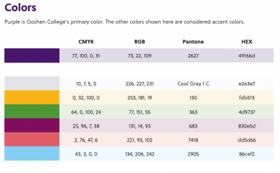
 Colors
Purple is Goshen College’s primary color. The other colors shown here are considered accent colors.The following five are the only colors that should appear on the website:
- Purple: PMS2627, #49166d, RGB 73-23-109
- Gray: PMS Cool Gray 1 C, #e2e3e7, RGB 226-227-231
- Yellow: PMS130, #fdb513, RGB 263-181-19
- Green: PMS363, #4d9737, RGB 77-151-55
- Purple-Red: PMS683, #830e5d, RGB 131-14-93
- Pink-red: PMS7418, #dd5d66, RGB 221-93-102
- Light Blue: PMS2905, #86cef2, RGB 134-206-242
Styles
- Any images inserted into a page should be placed in the right column, which can be done by specifying “rightcol” for the alignment of the image. Be sure to remove any dimensions from the image as they will distort the image in the right column. Elements such as text will not function in this column.
- When creating lists, use a bulleted (unordered) list.
- When creating a listing of people that contains photos and information on a group of people, use the style class=“photolist” to create a clean layout with columns (<ul class=“photolist clearfix”>). The photos should be on the left side of the text with an h3 header for the person’s name.
- Bolding should be used to show emphasis, rather than additional colors, all-caps, etc.
- Links should appear in purple (#49176D).
- Content on some pages will require the use of dividers to break up sections of information. To do so, add the “divider” class to the header which begins a new section.
Headers
Each page should use a hierarchy of headers at three different levels. Each page should also begin with the largest header (h1), followed by subsequent smaller headers. Headers 4 and 5 should not be used under typical circumstances.


