

Goshen College’s refreshed brand emphasizes ‘where everything connects’
Goshen College has unveiled a refresh to its brand, including a new website, new design elements, and language centered around the concept, “where everything connects.”
Goshen College collaborated with SimpsonScarborough, a leading higher education research, marketing and branding agency, to survey alumni, current students, employees, prospective students and community members to identify current perceptions; and then to develop creative concepts for the brand revitalization.
This newest evolution of GC’s brand identity is meant to increase awareness about the college and to more closely align with the college’s mission and vision, eliciting feelings of joy, purpose, creativity, compassion and pride.
“What we heard from our surveys is that GC is a place where connections are made: personally, socially, intellectually, spiritually and professionally,” said Dominique Burgunder-Johnson, vice president for marketing and enrollment. “It is a place where passion meets purpose and where hearts connect to minds. The result is a globally connected community of deep thinkers who are leading with courage and compassion, and making a resoundingly positive impact on their communities and the environment.”
Making educational connections – between what students study and what they can do with their degree - and making personal connections - meaningful relationships with peers and professors - is a hallmark of a Goshen College education.
“This brand refresh highlights what we do differently and better through contrasting points of parity,” Burgunder-Johnson said. “Our top-notch academic programs provide hands-on, real-world learning and career preparation with a focus on creating positive change in our world.”
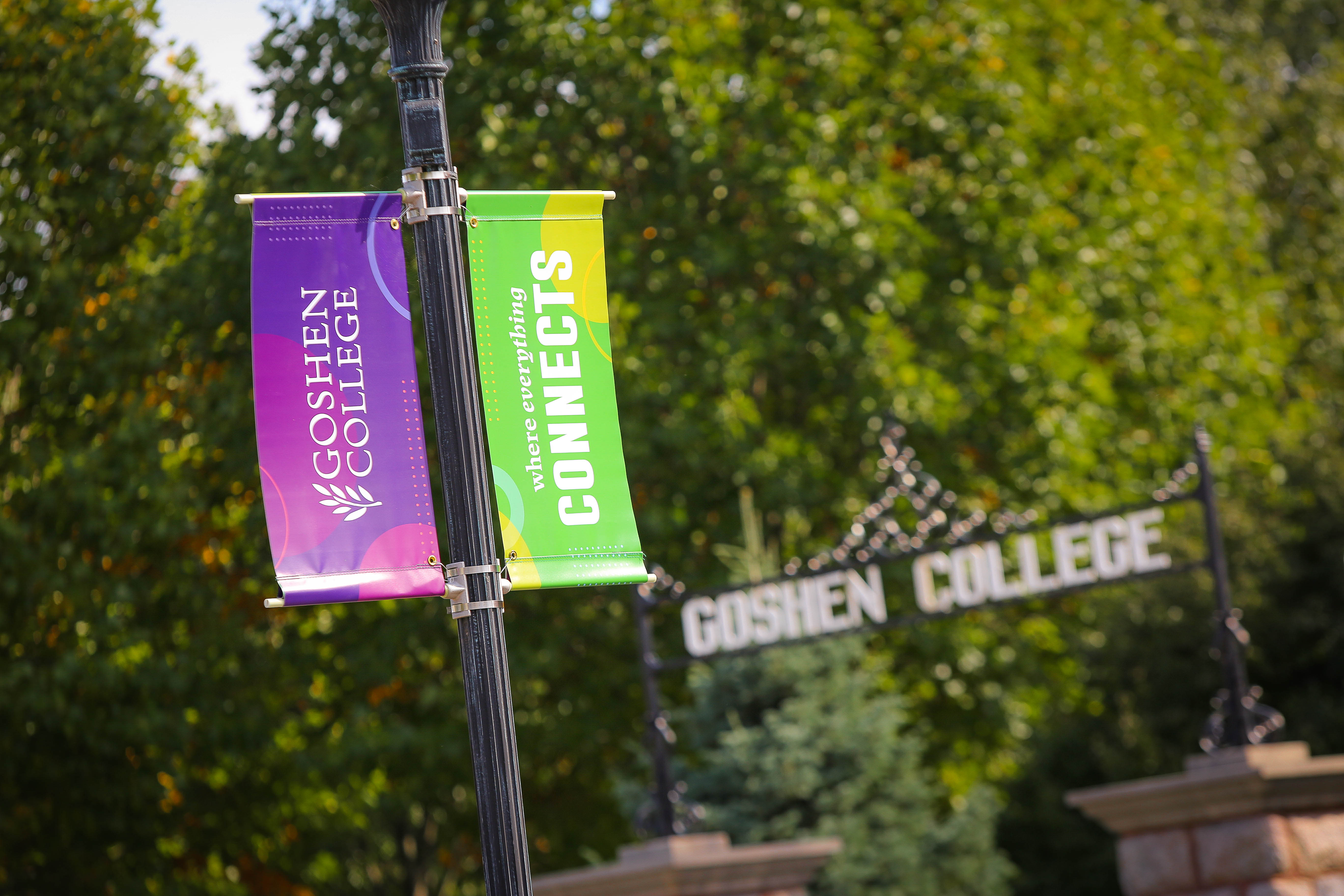
The brand refresh brings a voice and visual expression centered around creativity, compassion, courage, selflessness and pride, and is built upon brand pillars of a joyful and purposeful education, community and life.
Visually, the new brand is brought to life through a youthful-yet-sophisticated color palette, circles and dot patterns, and a mixture of bold serif and sans-serif typography that creates a dramatic departure from convention and feels proud and courageous.
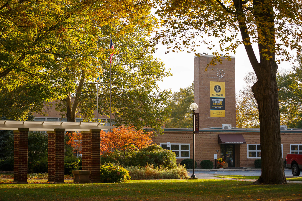
These new visual elements have been put to use through a revamped goshen.edu website, new viewbooks and other promotional materials, on-campus banners and other collateral that will roll out in the coming months.
Learn more at goshen.edu/brandrefresh